Storefront V4


How might we reduce friction in the user journey to improve order conversion rate?
2 Product Designers
3 Full Stack Developers
1 Tech Lead
Figma
Power BI
Launch Darkly
Gleanly
Interface and experience
Data analysis
A/B testing
User research interviews
Product Discoverability
Product Findability
Checkout Friction
Internal Tooling
Franchises
Franchisees
Consumers
Internal staff
↑ 2% pt
↓ 28s
↑ 10%
Design Process
Timeline

Success Metrics & Problem Areas

Discoverability
Product Suggestions
The Product Suggestions feature helps new users without an account to see the products that they are most likely to order at that franchise. For users who engage with this feature, they save time in browsing the menu and suffering decision fatigue.
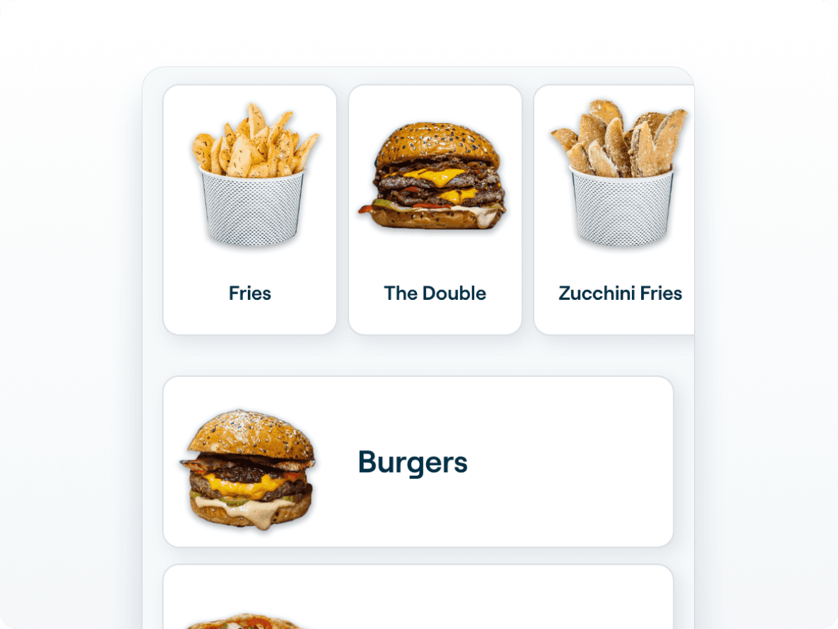
Restructuring the Menu
We had both quantitative and qualitative data (user screen recordings) to support that the longer users spend on our storefront the likelihood of them converting decreases by the minute. The largest portion of the time was always spent in the menu, with users either trying to discover what they want or find what they want. To solve our discoverability problem we opted to flatten the hierarchy of the menu that would reduce the user interactions by a third.

Navigating the Menu
Findability
Product Recommendations
Where Product Suggestions helps new users discover products, Product Recommendations help existing users find their favourites. If the user is logged in, they see recommendations based on their previous purchases and adjacent products from other users who have similar tastes.

Servicing Dietary Needs
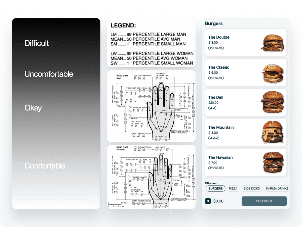
For users who have dietary sensitivities it was imperative our solution moved far away from its real world counterpart. Our solution could not stop at simply displaying relevant icons on menu items because that outcome ran contrary to our goal of getting users to make the best selections as fast as possible.We found that it is far more efficient for someone with a sensitivity to filter out what they cant eat and see what they can vs scanning an entire menu to see the sum of their options by memorising the relevant items.


Enabling Repeat Purchasing
Through our data we were able deduce that our users fall into two major archetypes when it comes to there purchasing behaviour. The two archetypes we found were, those who explore the menu on subsequent purchases and users who are creatures of habit that love their favourites. The ‘explorers’ are served by our discoverability initiatives, where as the users who enjoy their favourites were served by a feature we had on the Storefront’s previous version (V3) called Load Last Order. The feature as the name implies allows users to re-order the same products in one tap, it warranted another iteration due to its success in V3 (8% usage rate with a 69.7% conversion rate when used). For V4 we wanted to iterate on this feature by allowing users to edit their previous order before committing it to the cart. We also added the ability to bypass the cart completely proceed directly to payment.
Friction
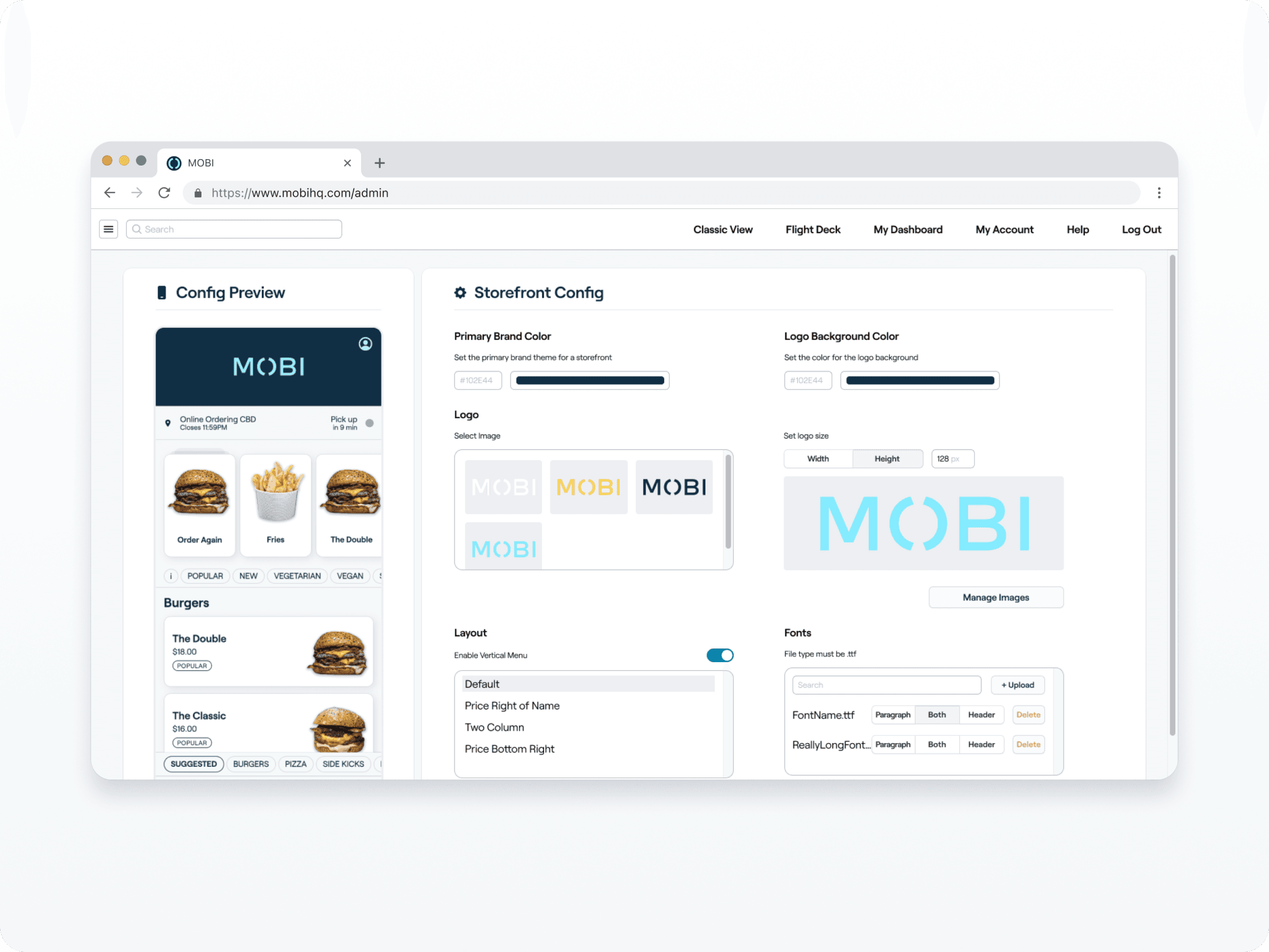
Simplifying Sign Up
Through our observation of guest usage, MOBI's sign up/ in flow has always presented as confusing. The confusion is due to the non standard staging of input fields, coupled with this the call to action buttons also give mixed messaging around what what the button will do. Currently one button navigates the user and the other confirms their input. Across our storefronts about 35% of orders are made by users who are new to the storefront, which is definitely a sizeable enough opportunity for us to build features focused on new users for.Our qualitative analysis of user session recordings (100 session sample size) shows friction to be the second largest contributor of drop out. All of these dropout occurrences happened at the check out, which is where the user is always prompted to sign up or sign in to continue.Our Simple Sign Up feature aims to take out the guess work for the user by having MOBI check whether they have an account or not. SSU achieves this by presenting the appropriate fields to fill in based on the email check.
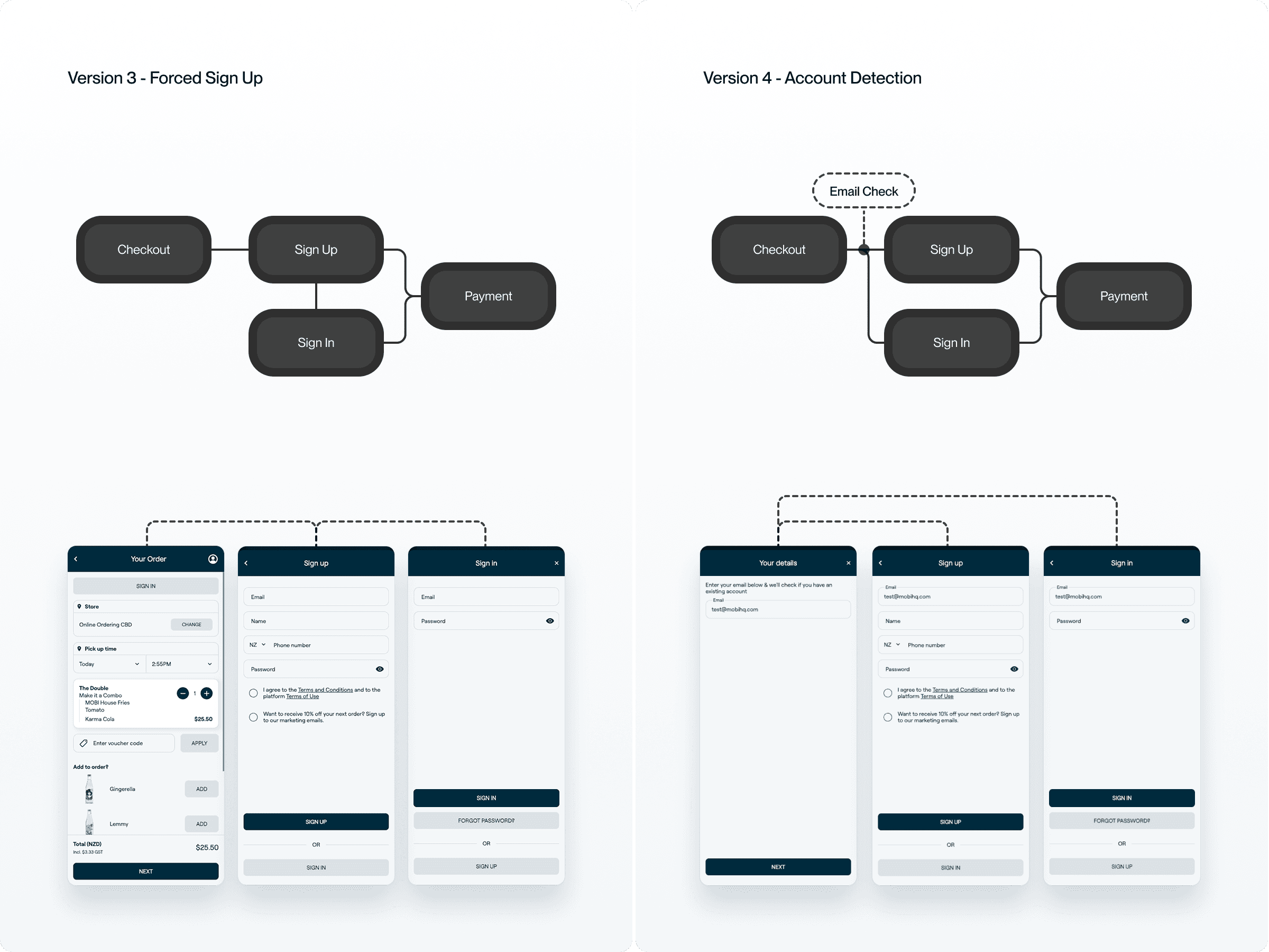
Guest Checkout
The Guest Checkout feature is an attempt to convert new/ first time visitors to a particular storefront who are tentative but willing to try a new brand for the first time. Guest Checkout aims to lower the bar of commitment required to convert, where the user is only required to provide a name, phone number or email to proceed.